Coloring a mandala is more than just filling in shapes—it can be a calming, meditative practice that helps you unwind while creating something beautiful. Whether you’re using printed pages, a coloring book, or digital tools, a few expert tips can transform flat designs into rich, vibrant patterns that feel both artistic and meaningful.
Below, you’ll learn how to choose colors, plan your design, and use specific techniques to make your mandala art truly stand out.
What Is a Mandala, Really?
At its core, a mandala is a circular design made up of repeating shapes, patterns, and symbols radiating from a central point. The word “mandala” comes from Sanskrit and is often translated as “circle” or “center.”
Historically, mandalas have been used in spiritual and religious traditions—especially in Buddhism and Hinduism—as tools for meditation and inner reflection (source: Encyclopaedia Britannica). Today, they’re also widely embraced in art therapy, mindfulness practices, and adult coloring books.
Key characteristics of a mandala design:
- A central focal point or symbol
- Symmetry and repetition around that center
- Rings or layers that move outward
- Often detailed, intricate patterns
Understanding these basics will help you decide how to approach your colors, because the structure guides the flow of your design.
Gather Your Ideal Mandala Coloring Tools
You can color a mandala with almost anything, but using the right tools makes a huge difference in vibrancy and control.
Recommended Coloring Media
- Colored pencils – Perfect for precision, layering, and shading. Great for small details.
- Alcohol markers – Bold, smooth color with minimal streaks. Best on thicker paper or marker paper.
- Water-based markers – Easy to use; watch for streaking and paper pilling.
- Gel pens – Ideal for metallics, neons, and highlighting small accents.
- Watercolors – Beautiful effects on high-quality, thick paper or watercolor paper.
Paper Matters
If you print your own mandala pages, choose:
- 80–100 lb cardstock for colored pencil, gel pen, or water-based marker
- Marker or mixed-media paper if you use alcohol markers or light watercolor techniques
Better paper prevents bleeding, buckling, and wear, so your mandala stays crisp and vibrant.
Understand the Structure of Your Mandala Before You Start
Before adding color, pause and study your mandala:
- Identify the center: This is the visual anchor of your design.
- Notice the rings: Most mandalas consist of circular “bands” radiating outward.
- Scan the symmetry: Elements often repeat at equal distances around the circle.
- Group related shapes: Petals, leaves, triangles, or geometric motifs that form patterns.
This quick analysis helps you:
- Decide which areas get bold vs. subtle colors
- Plan color repetition to create harmony
- Avoid random choices that make the mandala feel chaotic rather than cohesive
Plan Your Color Palette for Maximum Harmony
A well-planned palette can do more for your mandala than any fancy technique. Instead of grabbing every color you own, try to commit to a limited, harmonious set.
Choose a Color Scheme
Here are simple schemes that work beautifully for mandalas:
- Analogous: 3–4 colors next to each other on the color wheel (e.g., blue, blue-green, green). Creates a soothing, unified feel.
- Complementary: Colors opposite on the wheel (e.g., purple and yellow, blue and orange). Great for striking contrasts.
- Triadic: Three colors evenly spaced on the wheel (e.g., red, blue, yellow). Balanced but dynamic.
- Monochromatic: Different shades and tints of one color. Very meditative and cohesive.
Limit yourself to about 3–7 main colors, with a couple of neutrals (like gray, beige, or black) for balance.
Test Before You Commit
Use a scrap of the same paper to:
- Swatch each color
- Layer two or three colors to see blends
- Test pressure and shading
Once you see how the colors behave, you can confidently apply them to your mandala.
Work From the Center Out (or Outside In) With Intention
A mandala naturally draws the eye either from the center outward or from the edge inward. Choose one direction and be consistent for a more intentional design.
Center-Out Approach
- Color the center motif first with your most important or symbolic colors.
- Move to the next ring, repeating or slightly shifting your palette.
- Continue outward, gradually lightening, darkening, or changing intensities.
This approach emphasizes the idea of energy radiating from a core.
Outside-In Approach
- Start with the outer ring in stronger or darker tones.
- Work your way inward, reserving softer, lighter, or more luminous colors for the center.
- This creates a feeling of drawing the viewer’s attention inward.
Neither way is “correct”; choose the direction that feels better to you and stick with it throughout a single mandala.
Use Shading and Blending to Add Depth
Flat color can look nice, but subtle dimension is what makes a mandala design look truly professional.
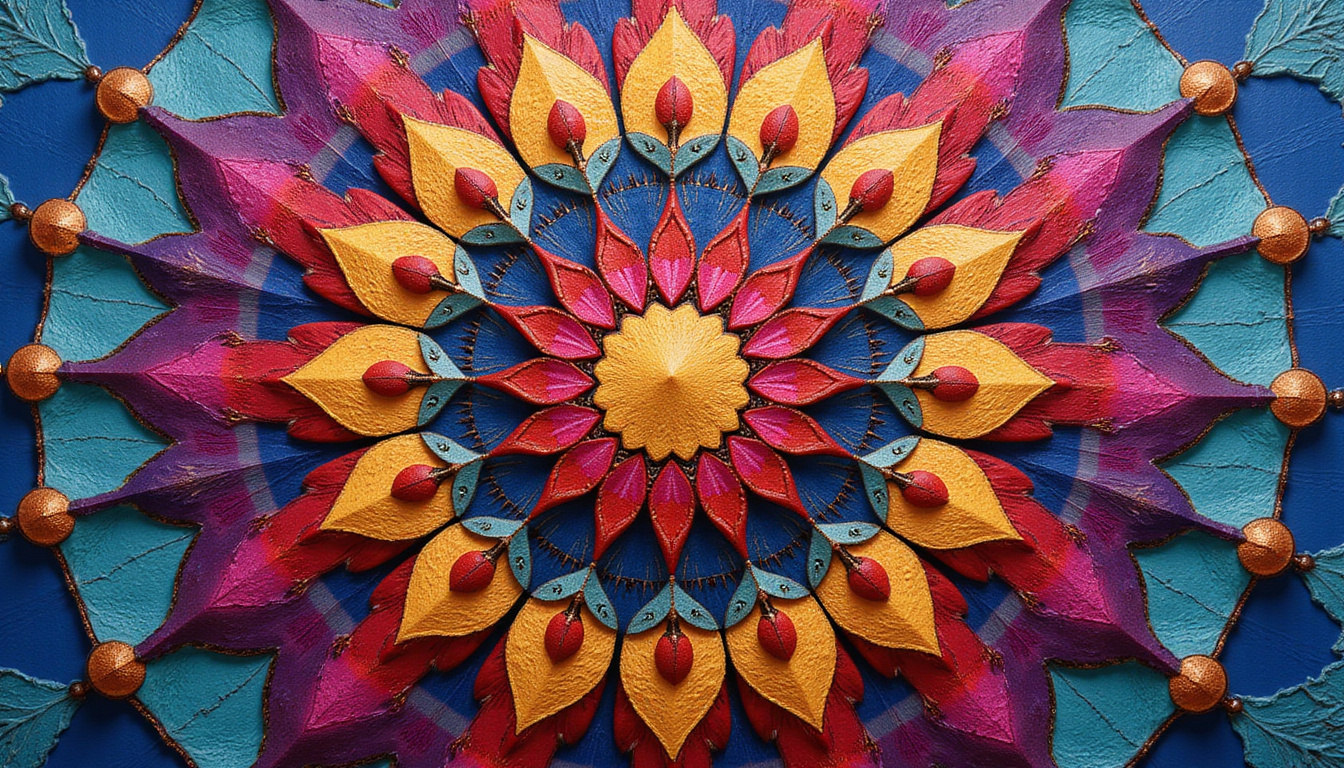
Shading Basics
- Light source: Imagine a light coming from one direction or from the center. Shade the opposite sides a bit darker.
- Pressure control (colored pencils):
- Light pressure for base layers
- Medium to heavy pressure in shadow areas
- Gradient petals and shapes: Start darker at the base of a petal or shape and gradually lighten toward the tip or outer edge.
Blending Techniques
- Layering: Build color slowly by layering related hues (e.g., light blue over turquoise).
- Colorless blender (pencils or markers): Use to smooth transitions between colors.
- Burnishing (pencils): Apply a light or neutral-colored pencil with firm pressure to “polish” and blend underlying layers.
On a mandala, apply these techniques to repeating elements (like a whole ring of petals) to create a dramatic, cohesive depth.
Use Contrast Strategically for a Vibrant Mandala
Vibrancy isn’t just about bright colors; it’s also about contrast.
Types of Contrast to Try
- Light vs. dark: Pair pale tones with rich, deep colors.
- Warm vs. cool: Combine warm reds, oranges, and yellows with cool blues and greens.
- Saturated vs. muted: Use bright accent colors against more subdued backgrounds.
A simple approach:
- Choose 1–2 accent colors to really pop (e.g., gold and magenta).
- Use more muted or analogous colors for the majority of the mandala.
- Place your accent colors sparingly to guide the viewer’s eye.
Add Details and Highlights for a Polished Finish
The difference between “nice” and “wow” often lies in tiny finishing touches.
Ideas for Extra Detail
- Outlining: Trace shapes or sections with a darker color or fineliner to define them.
- Highlights: Add small white gel pen dots or lines to mimic shine or light reflections.
- Metallic accents: Use metallic gel pens or paint for borders, dots, or select shapes.
- Pattern overlays: Lightly add stripes, dots, or cross-hatching inside larger sections.
Apply these embellishments sparingly. An overloaded mandala can feel cluttered; a few well-placed highlights create elegance.
Common Mandala Coloring Mistakes (and How to Avoid Them)
Even experienced colorists run into issues. Being aware of common mistakes helps you sidestep them.
-
Using too many colors
- Stick to a limited palette with clear roles for each color.
-
Inconsistent patterns
- If a shape repeats, color it consistently around the mandala to maintain symmetry.
-
Rushing through details
- Slow, controlled strokes reduce streaks and uneven coverage.
-
Bleeding markers
- Use thicker paper, test your markers, and avoid going over the same line too many times.
-
No break from the center or edge
- If you feel stuck, jump temporarily to another ring or section to avoid burnout and keep your mandala enjoyable.
A Simple Step-by-Step Workflow for Coloring Any Mandala
Use this quick sequence as a flexible guide:
- Study the design: Identify center, rings, and repeating shapes.
- Choose a palette: Pick a color scheme and swatch your colors.
- Decide direction: Center-out or outside-in.
- Lay base colors: Light layers to block in main sections and patterns.
- Add shading: Deepen areas for depth and dimension.
- Enhance contrast: Introduce accent colors and dark outlines where needed.
- Refine details: Highlights, metallics, and small patterns.
- Step back and adjust: Look at the entire mandala, then tweak any unbalanced areas.
FAQ: Mandala Coloring Questions Answered
1. What is the best way to start a mandala for beginners?
If you’re new to mandala art, choose a simpler mandala design with larger sections. Limit yourself to a small color palette—maybe three main colors plus one accent—and start coloring from the center outward. Use colored pencils first; they’re forgiving, easy to control, and ideal for practicing shading and blending.
2. How do I choose colors for a mandala pattern?
Start with your mood or goal. For relaxation, choose cool colors like blues and greens with soft purples. For energy and motivation, go for warm mandala colors like red, orange, and yellow. Use a color wheel to pick an analogous or complementary scheme, then test the colors together on scrap paper before applying them to your mandala drawing.
3. Can coloring mandalas really help with stress?
Many people find that focusing on the repetitive, symmetrical patterns of a mandala helps quiet their thoughts and reduce stress. The combination of gentle decision-making (like choosing colors) and repetitive motion can support mindfulness, making mandala coloring a simple, accessible way to relax and unwind at home or during breaks.
Bring Your Next Mandala to Life
With thoughtful color choices, careful shading, and a few finishing details, your next mandala can become a vibrant, eye-catching artwork instead of just another colored page. You don’t need professional training—just a bit of planning, the right tools, and the willingness to slow down and enjoy the process.
Print or open a new mandala design today, choose a small, intentional palette, and try working through the step-by-step workflow above. As you experiment and improve, each new mandala will reflect not only your growing skills, but also the calm and focus you bring to the page.
Now is the perfect time to gather your favorite coloring tools, pick a design that excites you, and start creating a mandala that feels both beautiful and uniquely yours.
Sacred objects often carry deep cultural and spiritual meaning. Learn how these symbols relate to history, spirituality, and the human mind by exploring more articles at SpiritualMindScience.com.